Design! Three Ways of Looking at Love
Ah, Valentine’s Day. Few holidays seem to raise the ire of internet denizens, brooding teenagers and twenty-something counter-culture warriors like good ole V-Day1. Depending on your point of view, it’s either a cultureless wasteland of affected sentimentalism and crass commercial cash-ins or a special day for you and your beloved. Then there are the rest of us: those of us who have experienced some sweet & thoughtful Valentine’s Days and remain effectively neutral on the holiday2. We don’t quite understand those people who will wheedle dates, arrange extra weekend meetings, or cover their calendars in pink and red-colored markers to cover their single status from friends and family. Nor do we totally understand the bruised hearts that rail against the organized cultural expression of love–but we might sympathize. To these happily neutral individuals, I dedicate these three Valentine’s-inspired designs.
Rather than throw these designs at you and say “thanks for stoppin’ by,” I’m going to yammer a bit about the individual pieces as we go along.
One: “Love Unlimited”


(Photoshop & Autodesk Sketchbook, 2009. Font-face Museo by Exljbris)
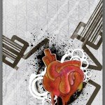
“Love Unlimited” is a diptych inspired by recursive design patterns that have regained a measure of popularity with the rise of vector-grunge graphics. The two parts to the design are the underlying “Love” poster design and the graffiti heart. The main element of the “Love” design is the word love twice overlaid into a symbol that, combined with a barcode-like termination on the two “Es,” reminds me of alien writing–frightening, unrecognizable, but coldly beautiful in its otherness.
The outer motif that frames the “Love” design was meant to recall the frame of a subway advertisement; the repetition of design in the diptych creates a sense of conformity that’s broken by the graffiti-inspired heart in the second panel. The interior “Love” design is kept simple–no major shading, except to simulate the look of artwork under glass–so that the graffiti heart would immediately jump out at the viewer as the most real, tangible element in the designs. The piece has a simple anti-corporate message: for all the flat corporate design that exists to support the V-Day industry, genuine, individualized expression beats it out every time. The part of Valentine’s Day that I enjoy is exactly in the spirit of culture-jamming: you don’t have to buy into mass-produced culture; you can write your love large across the face of conformity.
But hey, isn’t that love design cool anyhow?
Two: “Love and Monsters”
(Photoshop & Autodesk Sketchbook, 2009)
“Love and Monsters” is a play on the usual heart & banner motif that’s become a staple of Valentine’s Day design and contemporary fascination with random stuff radiating from an image’s focal point 3 . This heart, rather than being a lovely little trinket to give to your honey is a horror show: stitched back together, bound and locked, and crawling with monsters. Yet despite the outward horror, the image overall is an attractive one. The color palette uses complementary green/red tones to create a low-key composition. For those who aren’t brushed-up on color & perception theory, complementary colors are perceived on the same color receptors in the eye, and are thus used to bring out greater vibrancy in each other. The monsters and the heart, in color and in spirit, belong to each other. They bring out the best in each other.
I toyed with the idea of text on the banner, but overall I think the message is stronger without it. Provide your own. “Damaged Goods.” “Here Be Monsters.” “Worth It.”
Three: “Skeptical Panda’s Valentine’s Adventures”


(Photoshop & Autodesk Sketchbook, 2009)
Valentine’s Day, Playtime style. The line-quality of the pencil and the watercolor wash are faked in Photoshop for a “hand-drawn” look. This one doesn’t need much explaining. Isn’t it how all love falls on us?
- Not to be confused with the far more satisfying V-E Day on May 8th, when you send your honey a chocolate Panzer. ↩
- While it used to trouble me, this year I’m not overly concerned with my loss-leading record of 2-8. We’ve gotta roll with what we get. ↩
- This fascination with random profusion is, as you may have guessed, a direct result of street art / graffiti’s impact on advertising and design imagery. ↩


Leave your response!